v.2 | hat trick

v.2
Originally uploaded by filthEdesign
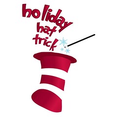
our copywriter mentioned that the brief called out specific use of the "cat in the hat" hat...and i found a great free font called "grinched"...tweaked a little to make it even more fun! :)
i like that the hat almost references a stocking and that the white stripes are actually negative space...in addition to the hat and font being instantly recognizable as seussian :)
could probably take out the magic want on this one really...now that i'm looking at it...but it doesn't bother me either...given where it originated.
oh and did i mention the turn-around-time was less than 24 hours for 2 finished pieces of collateral - not just the logo...so i feel pretty good about it all together!
Comments