protection 1 | daily logo design

protection 1 | daily logo design
Originally uploaded by filthEdesign
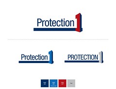
I really liked this for a while...strong, emphasis on the "1", eh...
A talented designer friend suggested the "1" started to look like a bracket instead of a 1...he's right...
Comments